Vitalnet Pie Chart Examples
Vitalnet pie charts clearly show parts of a whole. As shown on this page, Vitalnet allows you to easily customize your pie chart in many different ways, to best communicate how the pie is divided. Some examples follow:
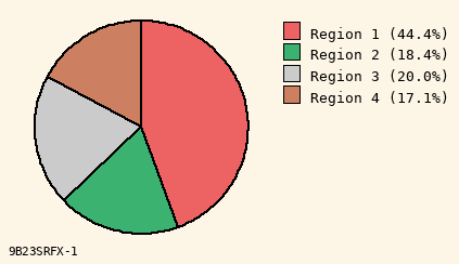
Pick pleasing background
Light yellow is nice.
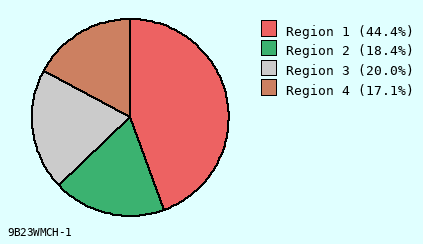
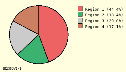
Pick pleasing background
Light cyan is an option.
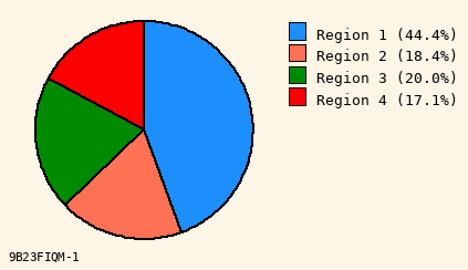
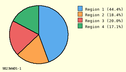
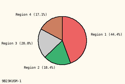
Choose color palette
Bright colors - more striking.
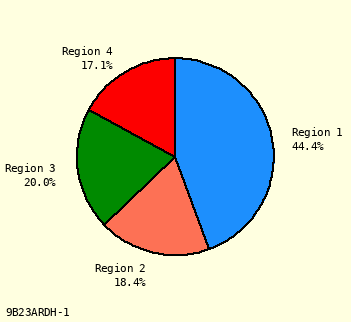
Choose color palette
Subdued colors - more subtle.
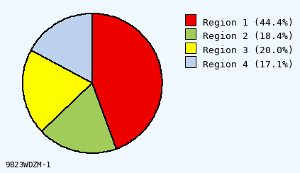
Color ordering
One ordering of many available.

Color ordering
Another ordering available.
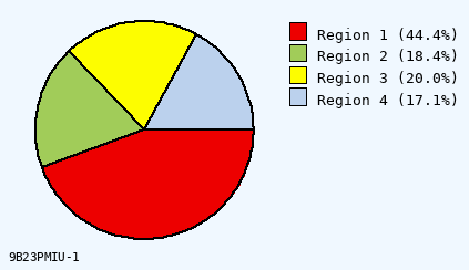
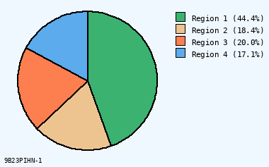
Rotate chart
Slice #1 starts - noon position.
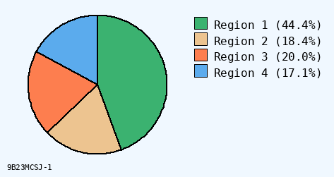
Rotate chart
Slice #1 starts - 3 pm position.

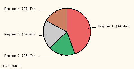
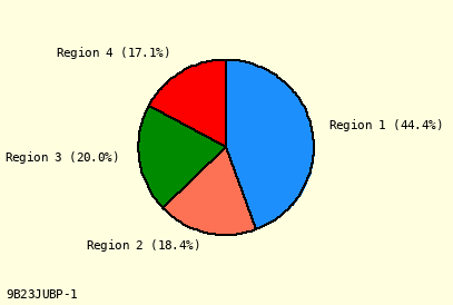
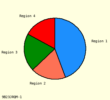
Where to put labels
Put labels in a legend.
Where to put labels
Draw lines from labels to slices.
Where to put labels
Put labels close to slices.
How to show percents
Put percents under label.
How to show percents
Put percents after label.
How to show percents
Omit percents.
Choose font size
Use 9 pt (smaller) size.
Choose font size
Use 11 pt (bigger) size.
Examples of Vitalnet pie chart capabilities:
|
Background:
Grey 95 · Light Cyan · White |
|
Colors in Pie:
Bright Colors · Subdued · Mixed Colors |
|
First Color:
A Forward · I Forward · H Reverse |
|
First Slice:
Noon Start · 3:00 Start · 9:00 Start |
|
Label Mode:
Line + Label · Label Only · Legend |
|
Percents:
Under Label · After Label · Omit Percents |
|
Radius:
2.0 cm Size · 2.5 cm Size · 3.0 cm Size |
|
Text Size:
9 pt Text · 10 pt Text · 11 pt Text |
Online help for Vitalnet pie charts