Vitalnet Output
Vitalnet quickly produces professional-quality output.
Publication-ready: Provides professional, clean output. Beautiful maps and charts are easily imported into your reports.
Fully documented: Avoids risk of misinterpretation. All parameters are cleanly listed so no question what was done.
Easily customized: Makes needed tables, charts, and maps. Add grid lines, choose colors, change size, etc.
Standards-compliant: Uses accepted methods and practices. Produces tables, maps, and charts that any viewer can understand.
Table Output · Map Output
Bar Charts · Line Charts · Pie Charts
Links to Other Output Examples
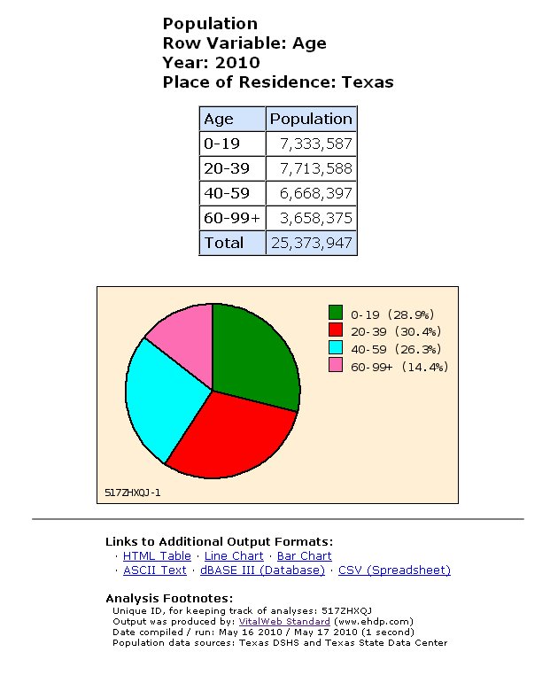
Tables
Quickly make any table needed.
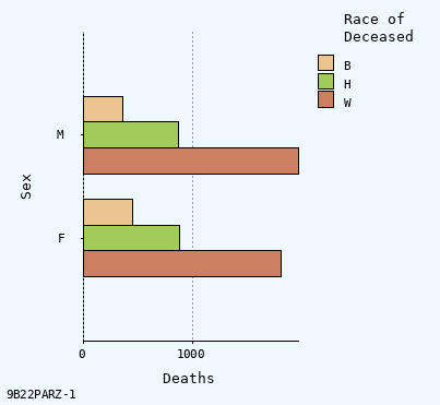
Bar Charts
Automatically made when appropriate.
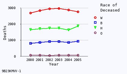
Line Charts
Charts are professional and attractive.
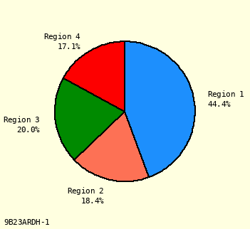
Pie Charts
Charts always appear correctly.
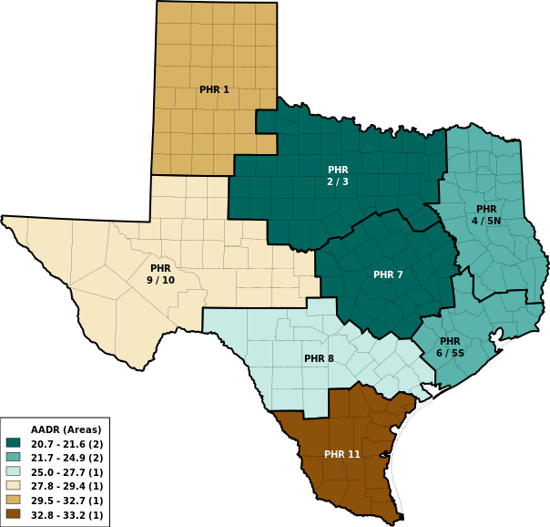
Maps
Beautiful customized thematic maps.